
How to Create Product Comparison Charts: Complete Guide for Better Sales
Learning how to create product comparison charts is essential for any business looking to showcase their offerings effectively and help customers make informed purchasing decisions. These visual tools have become indispensable in today’s competitive marketplace, where consumers are overwhelmed with choices and need clear, concise information to guide their buying journey.
Product comparison charts serve as powerful decision-making tools that can significantly impact your conversion rates and customer satisfaction. When customers can easily compare features, prices, and benefits side-by-side, they feel more confident about their purchase decisions. This confidence translates into higher sales and reduced cart abandonment rates. Whether you’re selling software, electronics, or services, a well-designed comparison chart maker can be the difference between a browsing visitor and a paying customer.
Understanding the Psychology Behind Comparison Charts
Before diving into the technical aspects of creating comparison charts, it’s crucial to understand why they work so effectively. Human psychology plays a significant role in decision-making processes. When faced with multiple options, people often experience choice paralysis – a phenomenon where too many choices lead to no decision at all. Comparison charts eliminate this paralysis by organizing information in a digestible format.
The visual nature of comparison charts appeals to different learning styles. Visual learners can quickly scan and process information, while analytical thinkers appreciate the structured data presentation. This dual appeal makes comparison charts universally effective across diverse customer segments.
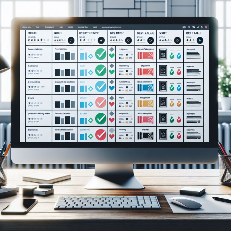
Essential Elements of Effective Product Comparison Charts
Clear Product Categories and Features
The foundation of any successful comparison chart lies in selecting the right features to compare. Start by identifying the most important attributes that influence purchasing decisions in your industry. These typically include price, key features, specifications, warranty information, and customer ratings. Avoid overwhelming your audience with too many comparison points – focus on the 5-7 most critical factors that differentiate your products.
Strategic Use of Visual Hierarchy
Visual hierarchy guides the reader’s eye through your comparison chart in a logical sequence. Use color coding, font sizes, and spacing strategically to highlight important information. Your premium or recommended product should stand out visually without appearing pushy. Consider using subtle highlighting, badges, or borders to draw attention to your preferred option.
Step-by-Step Guide to Creating Comparison Charts
Step 1: Research and Data Collection
Begin by gathering comprehensive information about each product you want to include in your comparison. This research phase is critical because inaccurate information can damage your credibility and lead to customer dissatisfaction. Create a spreadsheet with all relevant data points, including technical specifications, pricing tiers, feature availability, and any unique selling propositions.
Step 2: Choose Your Format and Layout
Decide whether your comparison chart will be horizontal or vertical based on the number of products and features you’re comparing. Horizontal layouts work well for comparing 2-4 products with multiple features, while vertical layouts are better for comparing many products with fewer key attributes. Consider your website’s responsive design requirements and ensure your chart remains readable on mobile devices.
Step 3: Design for Clarity and Conversion
Your comparison chart should guide users toward a purchase decision without being overly promotional. Use neutral language for feature descriptions while highlighting the unique benefits of each option. Include clear call-to-action buttons for each product, making it easy for customers to proceed with their preferred choice. The design should be clean, professional, and aligned with your brand identity.
Advanced Strategies for Comparison Chart Optimization
To maximize the effectiveness of your product comparison charts, consider implementing advanced optimization strategies. Mastering affiliate link placement becomes crucial when your comparison charts include affiliate products or partnerships. Strategic placement of these links can significantly boost your conversion rates while maintaining user trust.
Interactive Elements and User Experience
Modern comparison charts benefit from interactive elements that enhance user engagement. Consider adding features like filtering options, expandable sections for detailed specifications, or hover effects that reveal additional information. These interactive elements keep users engaged longer and provide them with the exact information they need to make purchasing decisions.
Mobile Optimization Considerations
With mobile commerce continuing to grow, your comparison charts must perform flawlessly on smartphones and tablets. This often means creating simplified mobile versions that focus on the most critical comparison points. Consider using accordion-style layouts or swipeable cards for mobile users, ensuring that all information remains accessible without horizontal scrolling.
Tools and Platforms for Creating Comparison Charts
Professional Design Software
Various tools can help you create professional-looking comparison charts, from simple online generators to sophisticated design software. Choose tools that offer templates specifically designed for product comparisons, as these will save time and ensure best practices are followed. Look for platforms that provide responsive design options and easy integration with your existing website.
E-commerce Integration
If you’re running an e-commerce business, especially in competitive markets like dropshipping, having robust comparison tools becomes even more critical. Platforms like Anstrex dropship can provide valuable insights into successful comparison strategies used by competitors, helping you refine your approach and stay ahead in the market.
Measuring Success and Continuous Improvement
Key Performance Indicators
Track specific metrics to measure the effectiveness of your comparison charts. Important KPIs include time spent on comparison pages, click-through rates on product links, conversion rates from comparison views, and customer feedback regarding the helpfulness of your charts. Use heat mapping tools to understand how users interact with your charts and identify areas for improvement.
A/B Testing Strategies
Continuously test different versions of your comparison charts to optimize performance. Test various layouts, color schemes, feature selections, and call-to-action placements. Small changes can lead to significant improvements in conversion rates. Document your findings and create a knowledge base of what works best for your specific audience and product categories.
Common Mistakes to Avoid
Many businesses make critical errors when creating comparison charts that can actually hurt their conversion rates. Avoid overwhelming customers with too much information, using biased language that appears manipulative, or creating charts that are difficult to read on mobile devices. Additionally, ensure that your comparison data is always up-to-date, as outdated information can lead to customer complaints and damaged trust.
Conclusion
Creating effective product comparison charts requires careful planning, strategic design, and continuous optimization. By following the comprehensive guidelines outlined in this guide, you’ll be able to create comparison charts that not only inform your customers but also drive conversions and boost your bottom line. Remember that successful comparison charts strike a balance between providing comprehensive information and maintaining clarity and ease of use. As you implement these strategies, continue monitoring performance metrics and gathering customer feedback to refine your approach. The investment in well-designed comparison charts will pay dividends through improved customer satisfaction, reduced support inquiries, and increased sales across your product lines.